
Two titanium Seamaster 007 editions landed on my desk last week, and I spent the better part of an afternoon studying them under daylight, warm indoor light, and a loupe. On the left sat VS Factory’s V4 release — the version I have recommended for months — and on the right, OR Factory’s recently returned offering. Both claim to capture the iconic Seamaster No Time to Die aesthetic, yet the moment you place them side by side, the difference in design logic and daily execution becomes subtle, but real.
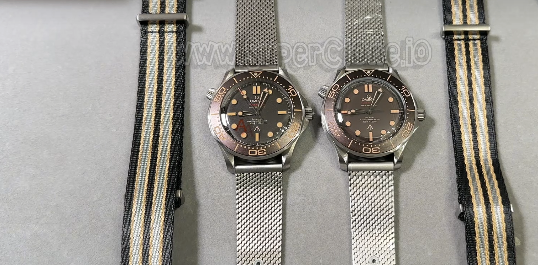
I have covered this specific reference multiple times before, but this is our first chance to run a direct comparison since OR resumed production. VS has iterated through four revisions to tune the dial tone, bezel text, and titanium finishing. OR, meanwhile, seems to have targeted the same reference piece with a slightly different set of manufacturing priorities. What follows is what I noticed after handling both watches over a few days — not a generic spec sheet, but practical observations from real bench time.
Dial Palette & Faux-Patina Lume Application
The dial is where the divide opens immediately. VS chose a deeper, dark charcoal foundation that sits closer to the genuine matte finish under varied room lighting. OR’s dial reads lighter — under direct light, it shifts toward a dark warm brown hue that gives off a vintage vibe, though it departs a bit from the muted look of the original piece.
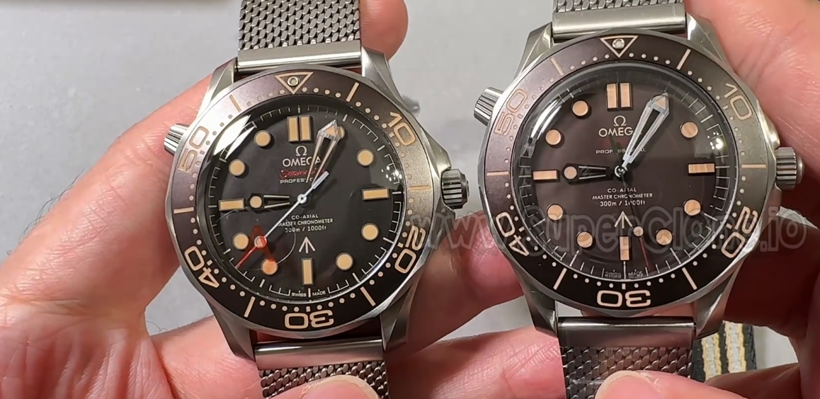
The luminous compound on the markers tells a similar story. VS opted for an aged cream shade that matches the bezel print cleanly. OR’s markers lean toward a warmer tone with a slight green tint under certain angles.
Bezel Engravings & Sapphire Crystal Height
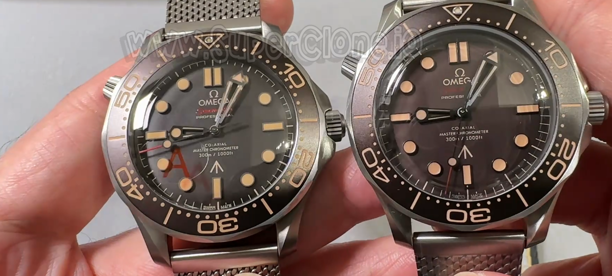
Turn to the bezel assembly, and the factory philosophies diverge further. VS pressed slightly thicker numerals into their bezel insert, giving the entire scale a bolder layout that is easier to read at a glance. OR’s numerals are slightly thinner and finer.
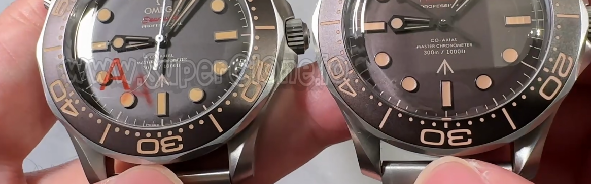
At 12 o’clock, the luminescent pearl shows another distinct choice. OR’s bezel pip is visibly larger and sits higher in its setting. VS kept the pearl smaller, sitting flush with the insert plane, which mirrors the low-profile look of the genuine tool watch.
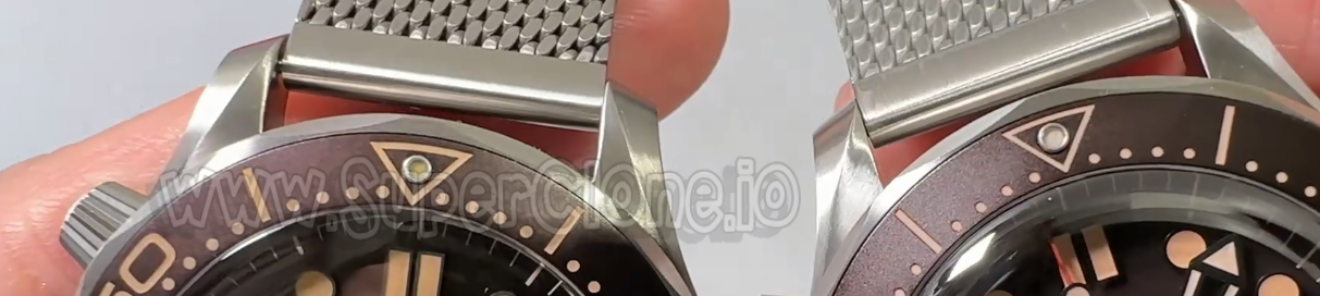
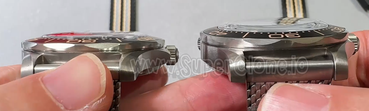
One structural detail that often gets overlooked in photos is crystal elevation. The sapphire crystal on the OR piece rises higher above the bezel line, creating a raised edge that catches light — and potentially table edges or door frames. VS mounts its domed crystal lower and tighter, keeping the side profile lean.
Titanium Mesh Weave & On-Wrist Comfort
Both factories ship with a mesh bracelet crafted from titanium to keep the watch light. However, the weave structure feels quite different once wrapped around a wrist. OR packed their mesh links tighter, giving the bracelet a firmer, more rigid feel right out of the box. VS went with a slightly looser weave pattern that drapes effortlessly over the arm bone without needing a long break-in period.
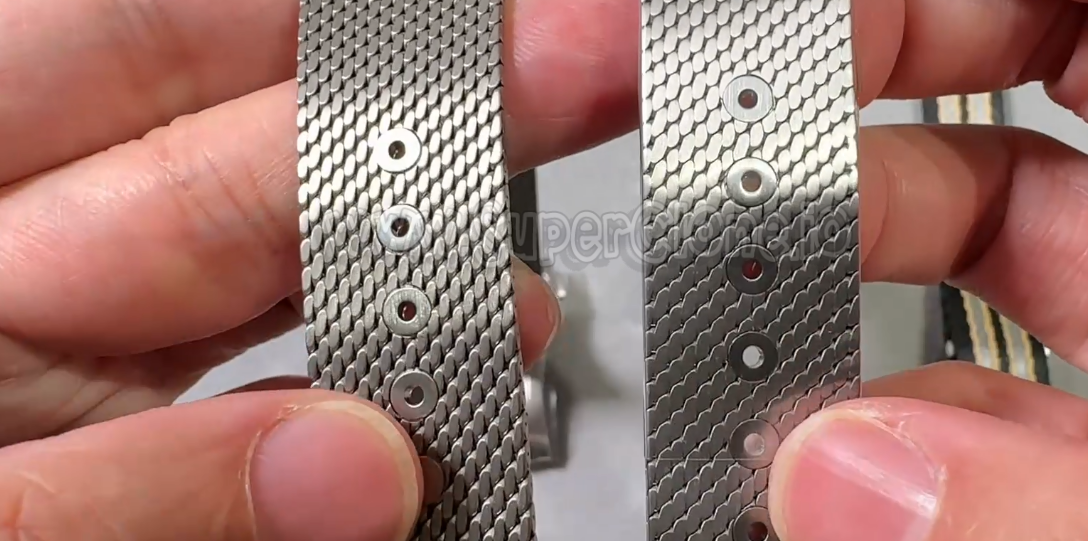
On the scale, the VS watch comes in at 98.7 grams while OR weighs 102.7 grams. That 4-gram gap sounds minimal, but on a lightweight watch meant to feel like almost nothing on the arm, you can actually tell the difference by the end of a full work day.
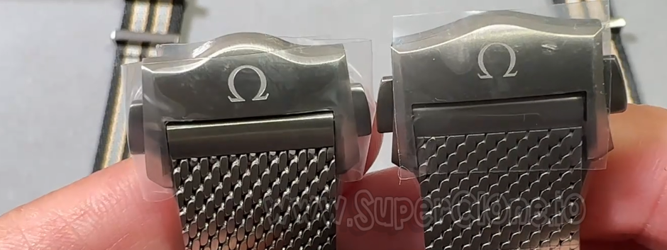
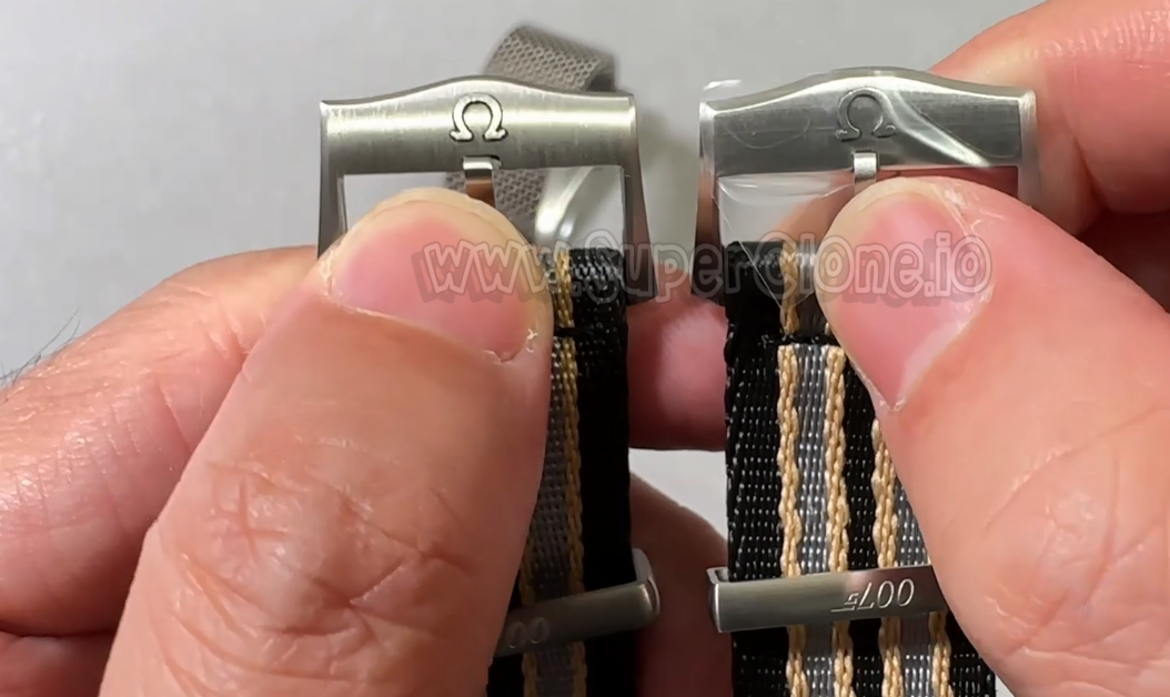
When you look closely at the folding clasp, OR holds a tiny lead. The engraved Omega logo on the OR buckle features cleaner line borders and slightly sharper edges than the VS equivalent.
NATO Hardware & Back-Case Movements
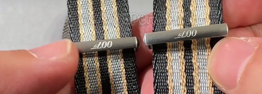
Moving to the included striped NATO strap, both buckle stampings feel a bit simple compared to the metal work on the watch cases themselves. However, the “007” identifier on the metal keeper loop differs: VS stamped the numbers significantly thicker and deeper, whereas OR went with a finer laser line.
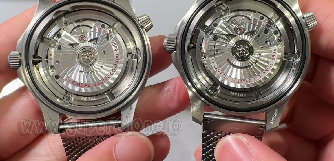
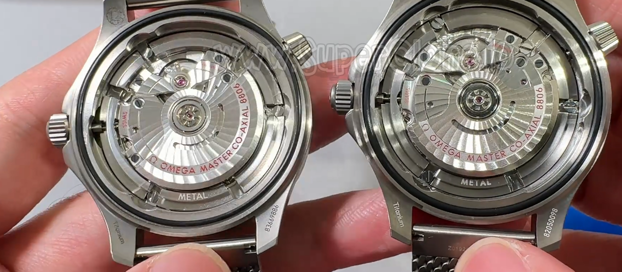
Looking through the back, both factories decorated their custom automatic movements to mirror the Co-Axial design layout. The rotor decoration, jewel setting polish, and black balance wheel alignment show clear factory signatures under magnification.
Key Differences
| Component / Area | VS Factory (V4 Edition) | OR Factory |
|---|---|---|
| Dial Base Color | Dark Matte Charcoal / Black | Warm Espresso / Brownish Tint |
| Bezel Markers | Thicker, bolder line infill | Slightly thinner line weight |
| Bezel Lume Pip | Flush profile, standard sizing | Larger raised dot profile |
| Sapphire Height | Sits close to bezel plane | Protrudes above bezel plane |
| Mesh Strap Feel | Supple, breaks in quickly | Tighter weave, firmer structure |
| Clasp Logo Sharpness | Standard impression depth | Slightly crisper emblem edges |
| Overall Weight | 98.7 grams | 102.7 grams |
If I had to wear one of these every day, VS V4 keeps my vote. The darker dial shade, flush crystal height, and supple mesh drape make it feel more natural on the wrist during regular wear. OR deserves credit for its sharp buckle logo and solid mesh build, but the taller crystal profile and warmer dial color keep it from taking the top spot for me.
How do these details look to you? If you have spent time with either of these on your own wrist, drop a comment below and share what you noticed.
